top of page
PROJECT: NORTON YOUNG READERS LOGO
CLIENT: NORTON YOUNG READERS
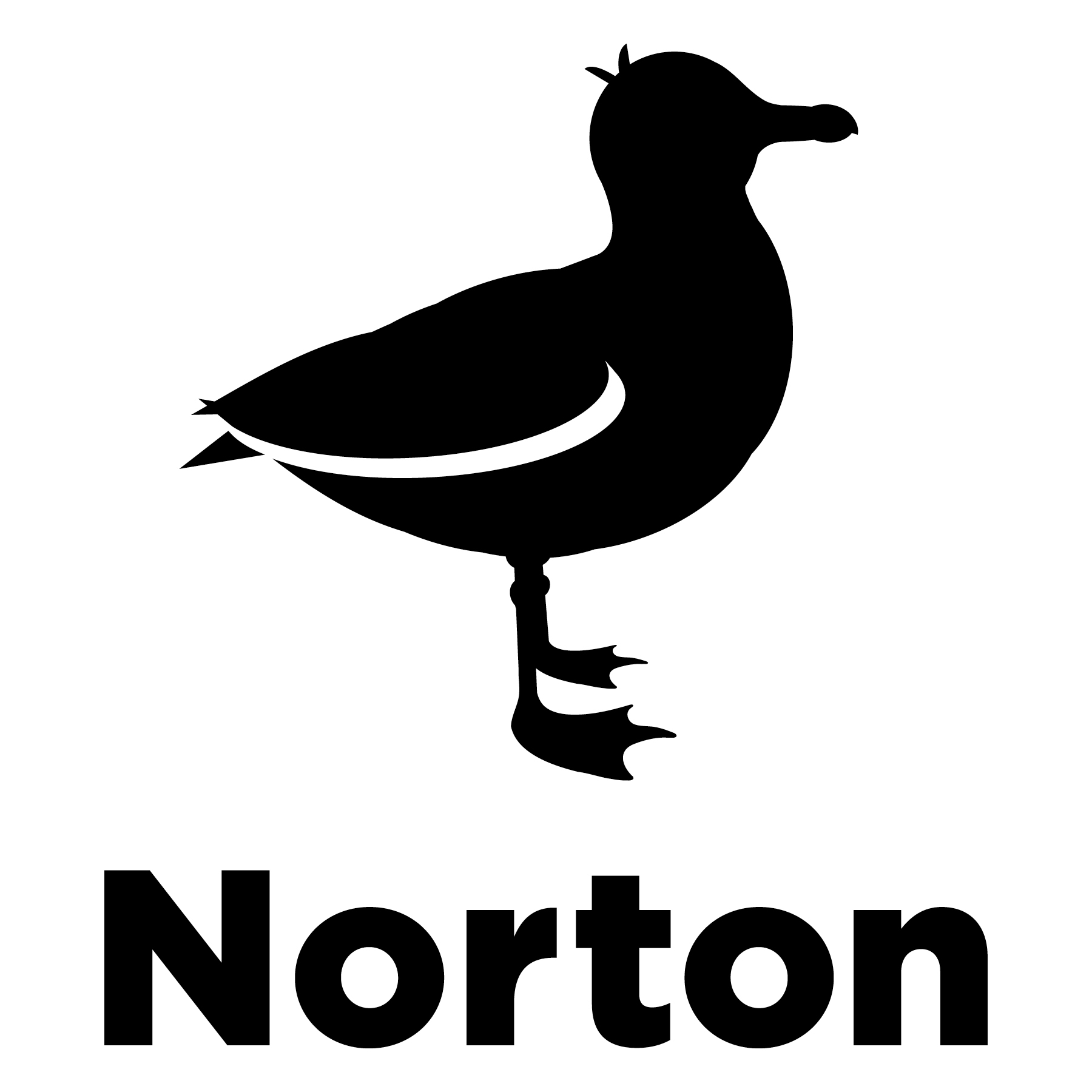
Designed the seagull logo for W. W. Norton & Company's new imprint. The main goal was to create an icon that helped differentiate the main company from the young readers brand. Therefore, I created a standing seagull which complemented the company's existing gull that is airborne. The President of the company and the editor of the imprint also wanted the new seagull to look young, but not too young as to alienate the readers within the middle grade and teenage categories. The final seagull has a bit off hair growing in atop its head, adding character and youth.
In addition to illustrating the seagull, I was responsible for determining all the rules regarding the use of the logo which were then written into the company's brand guidelines and will soon be distributed for employees and freelance designers.
FONT
I used the same font as the main company's logo for continuity, but instead of setting the imprint's name in all-caps, I made it upper-lowercase to seem younger, more accessible and to help further differentiate the two brands.
LOGO PLACEMENT AND SIZES ON SPINES
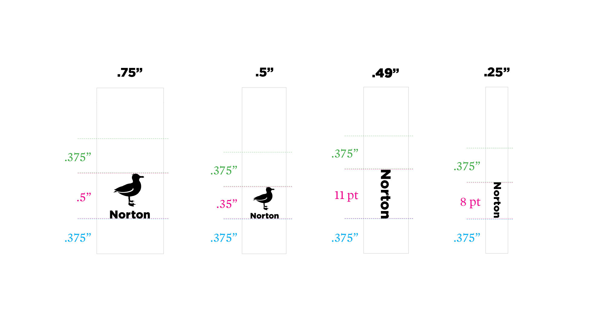
Since the spine of a book is what readers will see most often on their bookshelf or in stores, it was imperative that the logo be visible and easily distinguishable without losing too much detail at a smaller size. Therefore, it was decided that the smallest size at which the logo should appear on spines and in any print form is .35" high. On narrower spines, the imprint's name will appear without the seagull.
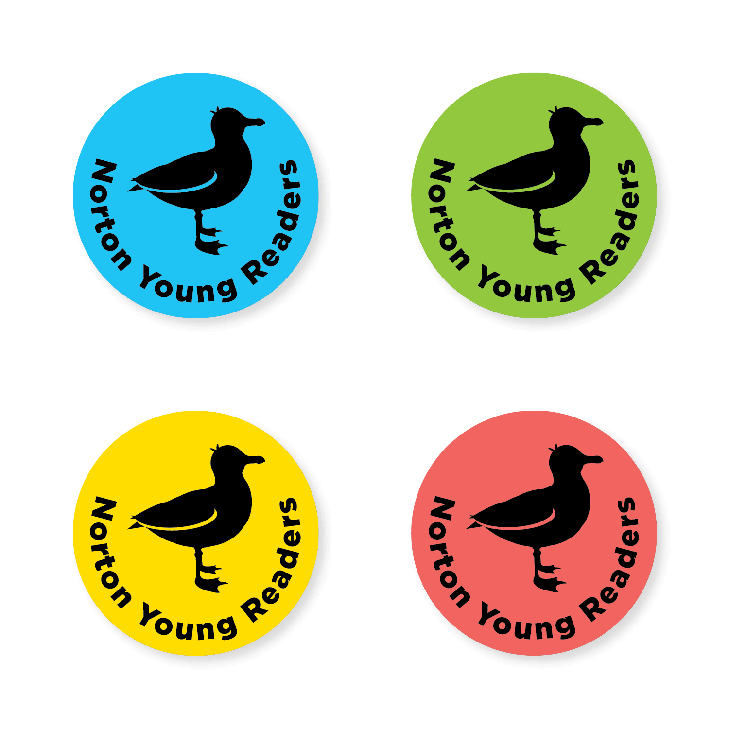
LOGO LOCK-UP ON BACK COVERS, FLAPS, TITLE PAGES AND ADVERTISING
In all other instances aside from the spine, the full imprint name will appear with the standing seagull. Left-aligned and centered lock-ups were created in black, white and the company's new colors to give designers flexibility when working on a project. Minimum sizes and specific placements were also determined for these lock-ups. The imprint's name can, at times, be used without the seagull, but the seagull should never appear without some mention of the imprint's name. The latter will allow consumers to familiarize themselves with the logo since it is indeed a new brand.
bottom of page